Our logo
Our logo is designed by Sarah Pyke. We have worked with Sarah over a number of years. Here, she sets out the thought process behind the concept and development of the Titchwell Press logo.

Named after the small village in North Norfolk, I began the design process of the Titchwell Press logo by researching the area and Titchwell's surrounding landscape, exploring it's flora and fauna. I decided to focus on the fact that it is very close to water; both lagoons and a sandy beach. As Titchwell will be publishing books predominantly centred around gardening and nature, it was fitting to come up with a logo that is inspired by nature. However, as there is scope to potentially publish other genres, such as art and culture, the design is not limited so that it feels only like a nature imprint.


Inspired by the tide marks and sand rills you find on a beach, I created a logo mark using the shape of an uppercase ‘T’ that is comprised of inconsistent, wavy lines – a clear link to water, waves and tide marks. Publishing houses are often referred to as 'imprints', which I also felt was a nice, subtle link to the concept, and the tide marks that are left ‘imprinted’ on the sand.
Using the uppercase 'T' is a simple but effective way to strengthen the company name in the minds of the reader and the use of a letter as the main icon suggests literature and words. An important feature of a publisher's logo is its application on book spines (often the first thing a reader sees); so I wanted to create an icon that would be recognisable and memorable when presented on its own, without the imprint name alongside it.

The typeface used to create the wordmark is Averia Serif Libre. The serif has an editorial feeling, but its soft, imperfect edges give a contemporary and organic quality. The slightly weathered look is a nod back to the sea, where things feel weather-beaten and textures are noticeably worn down, creating a soft aesthetic.
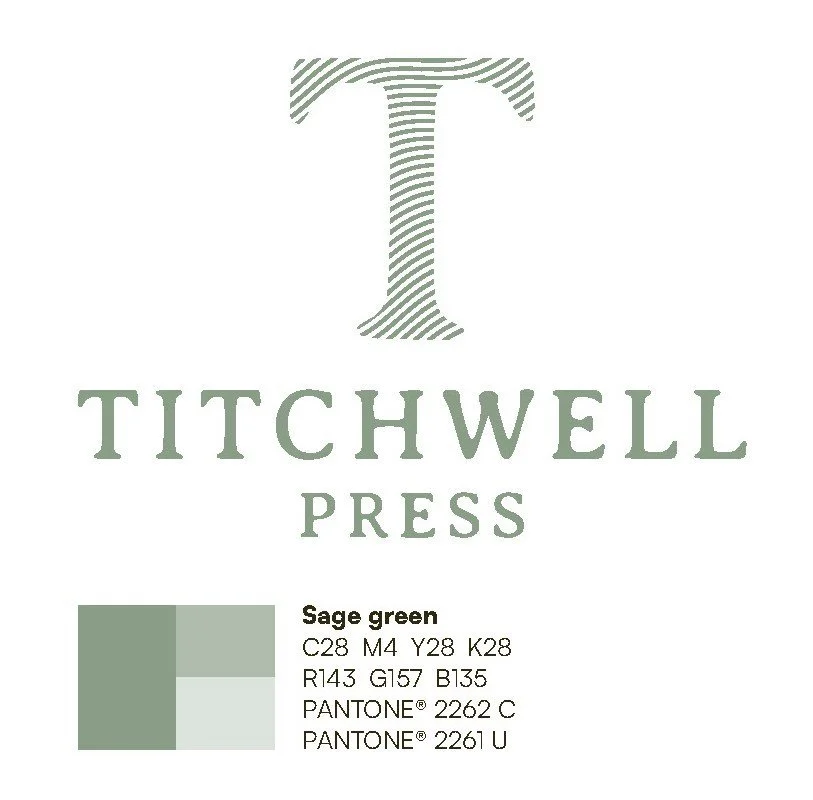
The logo colour is a soft, sage green. This shade of green has a strong connection to nature, tranquillity and calm. It’s also an elegant and fresh colour, which successfully communicates the values of Titchwell Press – high quality and contemporary. However, the logomark is also bold enough to work in both black and white.
You can see more of Sarah’s design work here